The interior and exterior of a book is very important. A well placed layout of a book makes the book easy to read and sends a message to the reader.
What exactly can you do to boost your ebook sale by as much as 268%? Nielsen BookData Information service provides market leading data services to more than 100 countries worldwide. The company collects book information from over 70 countries (including the UK, Ireland, Europe, Australia, New Zealand, India and South Africa) and works closely with the leading data providers in the US to provide consistent and comprehensive global database of title records. What Nielsen found in their Meta Data White Paper that books perform up to 268% better – if you have appealing cover art and images in meta data. Nielsen has gathered thousands and thousand of empirical evidence which shows how crucial and fundamental images are to your profit. High quality images are key.
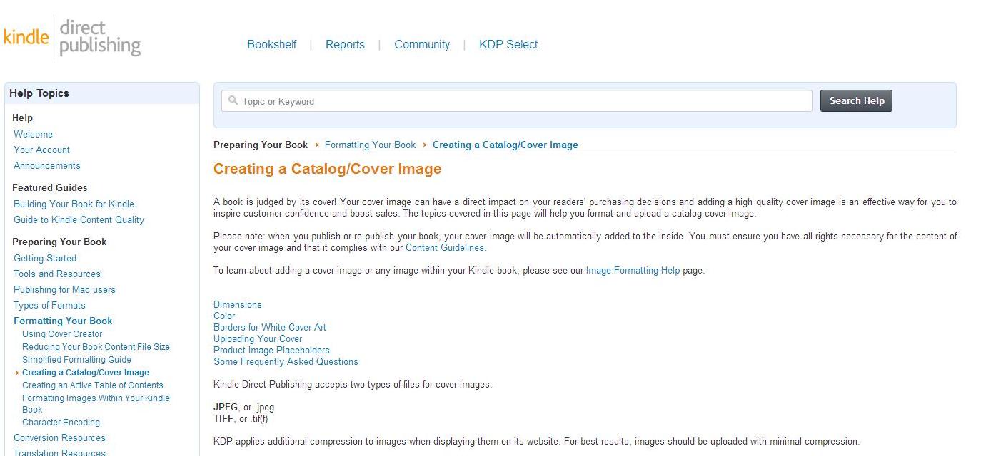
Amazon echo’s this in their product upload section stating the following:
THE MOST IMPORTANT PIECES OF THE PUZZLE
1)You need a high resolution jpeg. This is what most retailers will accept.
Look how the book cover at the left just jumps out at you. This not only matters with your electronic books but also for the print versions of your book.
The basic in book cover art starts with an understanding of how peoiple read at a book stand. People generally read:
- The first few pages
- Table of contents
- Back cover
- Side Flaps (Back & front)
2) Your back cover is the most important element for your print book. This also needs to be high resolution.Ensure you have added:
- Author Picture
- A Brief Synopsis of Your Book
- About the Author of Your Book
- Expert Reviews if You have Any
Ensure That You Have Covered These 10 Basics For Your Book Front & Back Cover
- All Images Are At Least 300Dpi
- Images Are Unique and Eye Cacthing
- The Cover Uses AT Least 2 Primary Colours (the picture above uses black and yellow)
- Images Reflect The Title
- Images Are Consistent for All Formats (paperback, ebook , etc)
- Images Need To Stand Out From The Crowd
- Must Be Easy To See Even As A Thumbnail
- Must Include a Spine Colour Or Text (Unless it is a small book with no spine)
- Must Not Exceed The Bleed
- MAKE IT JUST LOOK AS GREAT AS THE BEST LOOKING BOOK IN YOUR GENRE


